Modern CSS Explained For Dinosaurs
Images from Dinosaur Comics by Ryan North
CSS is strangely considered both one of the easiest and one of the hardest languages to learn as a web developer. It’s certainly easy enough to get started with it — you define style properties and values to apply to specific elements, and…that’s pretty much all you need to get going! However, it gets tangled and complicated to organize CSS in a meaningful way for larger projects. Changing any line of CSS to style an element on one page often leads to unintended changes for elements on other pages.
In order to deal with the inherent complexity of CSS, all sorts of different best practices have been established. The problem is that there isn’t any strong consensus on which best practices are in fact the best, and many of them seem to completely contradict each other. If you’re trying to learn CSS for the first time, this can be disorienting to say the least.
The goal of this article is to provide a historical context of how CSS approaches and tooling have evolved to what they are today in 2018. By understanding this history, it will be easier to understand each approach and how to use them to your benefit. Let’s get started!
Update: I made a new video course version of this article, which goes over the material with greater depth, check it out here:
https://firstclass.actualize.co/p/modern-css-explained-for-dinosaurs
Using CSS for basic styling #
Let’s start with a basic website using just a simple index.html file that links to a separate index.css file:
<!DOCTYPE html>
<html lang="en">
<head>
  <meta charset="UTF-8">
  <title>Modern CSS</title>
  <link rel="stylesheet" href="index.css">
</head>
<body>
  <header>This is the header.</header>
  <main>
    <h1>This is the main content.</h1>
    <p>...</p>
  </main>
  <nav>
    <h4>This is the navigation section.</h4>
    <p>...</p>
  </nav>
  <aside>
    <h4>This is an aside section.</h4>
    <p>...</p>
  </aside>
  <footer>This is the footer.</footer>
</body>
</html>
Right now we aren’t using any classes or ids in the HTML, just semantic tags. Without any CSS, the website looks like this (using placeholder text):
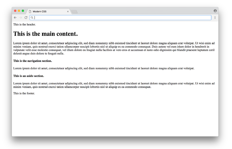
Click here to see a live example
Functional, but not very pretty. We can add CSS to improve the basic typography in index.css:
/* BASIC TYPOGRAPHY                       */
/* from https://github.com/oxalorg/sakura */

html {
  font-size: 62.5%;
  font-family: serif;
}

body {
  font-size: 1.8rem;
  line-height: 1.618;
  max-width: 38em;
  margin: auto;
  color: #4a4a4a;
  background-color: #f9f9f9;
  padding: 13px;
}

@media (max-width: 684px) {
  body {
    font-size: 1.53rem;
  }
}

@media (max-width: 382px) {
  body {
    font-size: 1.35rem;
  }
}

h1, h2, h3, h4, h5, h6 {
  line-height: 1.1;
  font-family: Verdana, Geneva, sans-serif;
  font-weight: 700;
  overflow-wrap: break-word;
  word-wrap: break-word;
  -ms-word-break: break-all;
  word-break: break-word;
  -ms-hyphens: auto;
  -moz-hyphens: auto;
  -webkit-hyphens: auto;
  hyphens: auto;
}

h1 {
  font-size: 2.35em;
}

h2 {
  font-size: 2em;
}

h3 {
  font-size: 1.75em;
}

h4 {
  font-size: 1.5em;
}

h5 {
  font-size: 1.25em;
}

h6 {
  font-size: 1em;
}
Here most of the CSS is styling the typography (fonts with sizes, line height, etc.), with some styling for the colors and a centered layout. You’d have to study design to know good values to choose for each of these properties (these styles are from sakura.css), but the CSS itself that’s being applied here isn’t too complicated to read. The result looks like this:
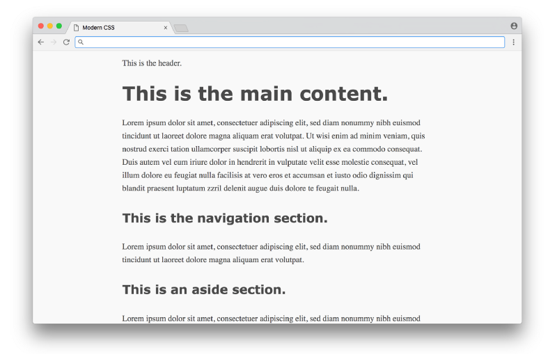
Click here to see a live example
What a difference! This is the promise of CSS — a simple way to add styles to a document, without requiring programming or complex logic. Unfortunately, things start to get hairier when we use CSS for more than just typography and colors (which we’ll tackle next).
Using CSS for layout #
In the 1990s, before CSS gained wide adoption, there weren’t a lot of options to layout content on the page. HTML was originally designed as a language to create plain documents, not dynamic websites with sidebars, columns, etc. In those early days, layout was often done using HTML tables — the entire webpage would be within a table, which could be used to organize the content in rows and columns. This approach worked, but the downside was the tight coupling of content and presentation — if you wanted to change the layout of a site, it would require rewriting significant amounts of HTML.
Once CSS entered the scene, there was a strong push to keep content (written in the HTML) separate from presentation (written in the CSS). So people found ways to move all layout code out of HTML (no more tables) into CSS. It’s important to note that like HTML, CSS wasn’t really designed to layout content on a page either, so early attempts at this separation of concerns were difficult to achieve gracefully.
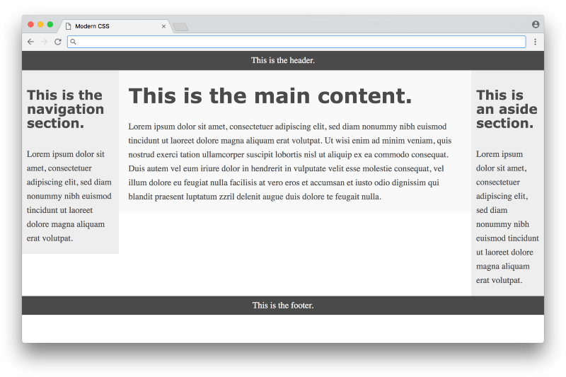
Let’s take a look at how this works in practice with our above example. Before we define any CSS layout, we’ll first reset any margins and paddings (which affect layout calculations) as well as give section distinct colors (not to make it pretty, but to make each section visually stand out when testing different layouts).
/* RESET LAYOUT AND ADD COLORS */

body {
  margin: 0;
  padding: 0;
  max-width: inherit;
  background: #fff;
  color: #4a4a4a;
}

header, footer {
  font-size: large;
  text-align: center;
  padding: 0.3em 0;
  background-color: #4a4a4a;
  color: #f9f9f9;
}

nav {
  background: #eee;
}

main {
  background: #f9f9f9;
}

aside {
  background: #eee;
}
Now the website temporarily looks like:
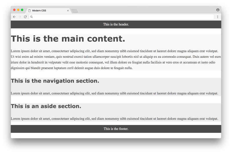
Click here to see a live example
Now we’re ready to use CSS to layout the content on the page. We’ll look at three different approaches in chronological order, starting with the classic float-based layouts.
Float-based layout #
The CSS float property was originally introduced to float an image inside a column of text on the left or right (something you often see in newspapers). Web developers in the early 2000s took advantage of the fact that you could float not just images, but any element, meaning you could create the illusion of rows and columns by floating entire divs of content. But again, floats weren’t designed for this purpose, so creating this illusion was difficult to pull off in a consistent fashion.
In 2006, A List Apart published the popular article In Search of the Holy Grail, which outlined a detailed and thorough approach to creating what was known as the Holy Grail layout — a header, three columns and a footer. It’s pretty crazy to think that what sounds like a fairly straightforward layout would be referred to as the Holy Grail, but that was indeed how hard it was to create consistent layout at the time using pure CSS.
Below is a float-based layout for our example based on the technique described in that article:
/* FLOAT-BASED LAYOUT */

body {
  padding-left: 200px;
  padding-right: 190px;
  min-width: 240px;
}

header, footer {
  margin-left: -200px;
  margin-right: -190px;
}

main, nav, aside {
  position: relative;
  float: left;
}

main {
  padding: 0 20px;
  width: 100%;
}

nav {
  width: 180px;
  padding: 0 10px;
  right: 240px;
  margin-left: -100%;
}

aside {
  width: 130px;
  padding: 0 10px;
  margin-right: -100%;
}

footer {
  clear: both;
}

* html nav {
  left: 150px;
}
Looking at the CSS, you can see there are quite a few hacks necessary to get it to work (negative margins, the clear: both property, hard-coded width calculations, etc.) — the article does a good job explaining the reasoning for each in detail. Below is what the result looks like:
Click here to see a live example
This is nice, but you can see from the colors that the three columns are not equal in height, and the page doesn’t fill the height of the screen. These issues are inherent with a float-based approach. All a float can do is place content to the left or right of a section — the CSS has no way to infer the heights of the content in the other sections. This problem had no straightforward solution until many years later, with a flexbox-based layout.
Flexbox-based layout #
The flexbox CSS property was first proposed in 2009, but didn’t get widespread browser adoption until around 2015. Flexbox was designed to define how space is distributed across a single column or row, which makes it a better candidate for defining layout compared to using floats. This meant that after about a decade of using float-based layouts, web developers were finally able to use CSS for layout without the need for the hacks needed with floats.
Below is a flexbox-based layout for our example based on the technique described on the site Solved by Flexbox (a popular resource showcasing different flexbox examples). Note that in order to make flexbox work, we need to an an extra wrapper div around the three columns in the HTML:
<!DOCTYPE html>
<html lang="en">
<head>
  <meta charset="UTF-8">
  <title>Modern CSS</title>
  <link rel="stylesheet" href="index.css">
</head>
<body>
  <header>This is the header.</header>
  <div class="container">
    <main>
      <h1>This is the main content.</h1>
      <p>...</p>
    </main>
    <nav>
      <h4>This is the navigation section.</h4>
      <p>...</p>
    </nav>
    <aside>
      <h4>This is an aside section.</h4>
      <p>...</p>
    </aside>
  </div>
  <footer>This is the footer.</footer>
</body>
</html>
And here’s the flexbox code in the CSS:
/* FLEXBOX-BASED LAYOUT */

body {
  min-height: 100vh;
  display: flex;
  flex-direction: column;
}

.container {
  display: flex;
  flex: 1;
}

main {
  flex: 1;
  padding: 0 20px;
}

nav {
  flex: 0 0 180px;
  padding: 0 10px;
  order: -1;
}

aside {
  flex: 0 0 130px;
  padding: 0 10px;
}
That is way, way more compact compared to the float-based layout approach! The flexbox properties and values are a bit confusing at first glance, but it eliminates the need for a lot of the hacks like negative margins that were necessary with float-based layouts — a huge win. Here is what the result looks like:
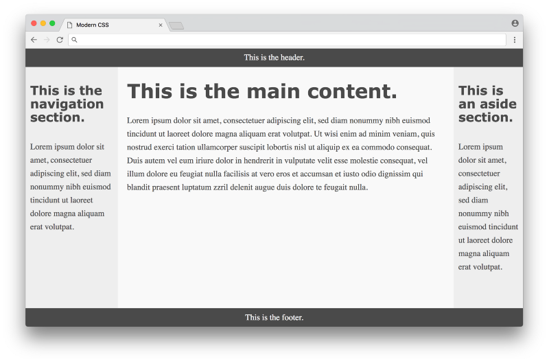
Click here for a live example
Much better! The columns are all equal height and take up the full height of the page. In some sense this seems perfect, but there are a couple of minor downsides to this approach. One is browser support — currently every modern browser supports flexbox, but some older browsers never will. Fortunately browser vendors are making a bigger push to end support for these older browsers, making a more consistent development experience for web designers. Another downside is the fact that we needed to add the <div class="container"> to the markup — it would be nice to avoid it. In an ideal world, any CSS layout wouldn’t require changing the HTML markup at all.
The biggest downside though is the code in the CSS itself — flexbox eliminates a lot of the float hacks, but the code isn’t as expressive as it could be for defining layout. It’s hard to read the flexbox CSS and get a visual understanding how all of the elements will be laid out on the page. This leads to a lot of guessing and checking when writing flexbox-based layouts.
It’s important to note again that flexbox was designed to space elements within a single column or row — it was not designed for an entire page layout! Even though it does a serviceable job (much better than float-based layouts), a different specification was specifically developed to handle layouts with multiple rows and columns. This specification is known as CSS grid.
Grid-based layout #
CSS grid was first proposed in 2011 (not too long after the flexbox proposal), but took a long time to gain widespread adoption with browsers. As of early 2018, CSS grid is supported by most modern browsers (a huge improvement over even a year or two ago).
Below is a grid-based layout for our example based on the first method in this CSS tricks article. Note that for this example, we can get rid of the <div class="container"> that we had to add for the flexbox-based layout — we can simply use the original HTML without modification. Here’s what the CSS looks like:
/* GRID-BASED LAYOUT */

body {
  display: grid;
  min-height: 100vh;
  grid-template-columns: 200px 1fr 150px;
  grid-template-rows: min-content 1fr min-content;
}

header {
  grid-row: 1;
  grid-column: 1 / 4;
}

nav {
  grid-row: 2;
  grid-column: 1 / 2;
  padding: 0 10px;
}

main {
  grid-row: 2;
  grid-column: 2 / 3;
  padding: 0 20px;
}

aside {
  grid-row: 2;
  grid-column: 3 / 4;
  padding: 0 10px;
}

footer {
  grid-row: 3;
  grid-column: 1 / 4;
}
The result is visually identical to the flexbox based layout. However, the CSS here is much improved in the sense that it clearly expresses the desired layout. The size and shape of the columns and rows are defined in the body selector, and each item in the grid is defined directly by its position.
One thing that can be confusing is the grid-column property, which defines the start point / end point of the column. It can be confusing because in this example, there are 3 columns, but the numbers range from 1 to 4. It becomes more clear when you look at the picture below:
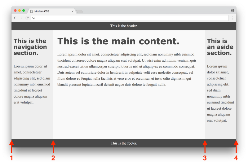
Click here to see a live example
The first column starts at 1 and ends at 2, the second column starts at 2 and ends at 3, and the third column starts at 3 and ends at 4. The header has a grid-column of 1 / 4 to span the entire page, the nav has a grid-column of 1 / 2 to span the first column, etc.
Once you get used to the grid syntax, it clearly becomes the ideal way to express layout in CSS. The only real downside to a grid-based layout is browser support, which again has improved tremendously over the past year. It’s hard to overstate the importance of CSS grid as the first real tool in CSS that was actually designed for layout. In some sense, web designers have always had to be very conservative with making creative layouts, since the tools up until now have been fragile, using various hacks and workarounds. Now that CSS grid exists, there is the potential for a new wave of creative layout designs that never would have been possible before — exciting times!
Using a CSS preprocessor for new syntax #
So far we’ve covered using CSS for basic styling as well as layout. Now we’ll get into tooling that was created to help improve the experience of working with CSS as a language itself, starting with CSS preprocessors.
A CSS preprocessor allows you to write styles using a different language which gets converted into CSS that the browser can understand. This was critical back in the day when browsers were very slow to implement new features. The first major CSS preprocessor was Sass, released in 2006. It featured a new concise syntax (indentation instead of brackets, no semicolons, etc.) and added advanced features missing from CSS, such as variables, helper functions, and calculations. Here’s what the color section of our earlier example would look like using Sass with variables:
$dark-color: #4a4a4a
$light-color: #f9f9f9
$side-color: #eee

body
  color: $dark-color

header, footer
  background-color: $dark-color
  color: $light-color

main
  background: $light-color

nav, aside
  background: $side-color
Note how reusable variables are defined with the $ symbol, and that brackets and semicolons are eliminated, making for a cleaner looking syntax. The cleaner syntax in Sass is nice, but features like variables were revolutionary at the time, as they opened up new possibilities for writing clean and maintainable CSS.
To use Sass, you need to install Ruby, the programming language used to compile Sass code to regular CSS. Then you would need to install the Sass gem, then run a command in the command line to convert your .sass files into .css files. Here’s an example of what a command would look like:
sass --watch index.sass index.css
This command will convert Sass code written in a file named index.sass to regular CSS in a file named index.css (the --watch argument tells it to run any time the input changes on save, which is convenient).
This process is known as a build step, and it was a pretty significant barrier to entry back in 2006. If you’re used to programming languages like Ruby, the process is pretty straightforward. But many frontend developers at the time only worked with HTML and CSS, which did not require any such tools. So it was a big ask to have someone learn an entire ecosystem to be able to get the features offered by a CSS preprocessor.
In 2009, the Less CSS preprocessor was released. It was also written in Ruby, and offered similar features to Sass. The key difference was the syntax, which was designed to be as close to CSS as possible. This means that any CSS code is valid Less code. Here’s the same example written using Less syntax:
@dark-color: #4a4a4a;
@light-color: #f9f9f9;
@side-color: #eee;

body {
  color: @dark-color;
}

header, footer {
  background-color: @dark-color;
  color: @light-color;
}

main {
  background: @light-color;
}

nav, aside {
  background: @side-color;
}
It’s nearly the same (@ prefix instead of $ for variables), but not as pretty as the Sass example, with the same curly brackets and semi-colons as CSS. Yet the fact that it’s closer to CSS made it easier for developers to adopt it. In 2012, Less was rewritten to use JavaScript (specifically Node.js) instead of Ruby for compiling. This made Less faster than its Ruby counterparts, and made it more appealing to developers who were already using Node.js in their workflows.
To convert this code to regular CSS, you would first need to install Node.js, then install Less, then run a command like:
lessc index.less index.css
This command will convert Less code written in a file named index.less to regular CSS in a file named index.css. Note that the lessc command does not come with a way to watch files for changes (unlike the sass command), meaning you would need to install a different tool to automatically watch and compile .less files, adding a bit more complexity to the process. Again, this is not difficult for programmers who are used to using command line tools, but it is a significant barrier to entry for others who simply want to use a CSS preprocessor.
As Less gained mindshare, Sass developers adapted by adding a new syntax called SCSS in 2010 (which was a superset of CSS similar to Less). They also released LibSass, a C/C++ port of the Ruby Sass engine, which made it faster and able to be used in various languages.
Another alternative CSS preprocessor is Stylus, which came out in 2010, written in Node.js, and focuses on cleaner syntax compared to Sass or Less. Usually conversations about CSS preprocessors focus on those three as the most popular (Sass, Less, and Stylus). In the end, they are all pretty similar in terms of the features they offer, so you can’t really go wrong picking any of them.
However, some people make the argument that CSS preprocessors are becoming less necessary, as browsers are finally beginning to implement some of their features (such as variables and calculations). Furthermore, there’s a different approach known as CSS postprocessing that has the potential to make CSS preprocessors obsolete (obviously not without controversy), which we’ll get into next.
Using a CSS postprocessor for transformative features #
A CSS postprocessor uses JavaScript to analyze and transform your CSS into valid CSS. In this sense it’s pretty similar to a CSS preprocessor — you can think of it as a different approach to solving the same problem. The key difference is that while a CSS preprocessor uses special syntax to identify what needs to be transformed, a CSS postprocessor can parse regular CSS and transform it without any special syntax required. This is best illustrated with an example. Let’s look at a part of the CSS we originally defined above to style the header tags:
h1, h2, h3, h4, h5, h6 {
  -ms-hyphens: auto;
  -moz-hyphens: auto;
  -webkit-hyphens: auto;
  hyphens: auto;
}
The items in bold are called vendor prefixes. Vendor prefixes are used by browsers when they are experimentally adding or testing new CSS features, giving a way for developers to use these new CSS properties while the implementation is being finalized. Here the -ms prefix is for Microsoft Internet Explorer, the -moz prefix is for Mozilla Firefox, and the -webkit prefix is for browsers using the webkit rendering engine (like Google Chrome, Safari, and newer versions of Opera).
It’s pretty annoying to remember to put in all these different vendor prefixes to use these CSS properties. It would be nice to have a tool that can automatically put in vendor prefixes as needed. We can sort of pull this off with CSS preprocessors. For example, you could do something like this with SCSS:
@mixin hyphens($value) {
  -ms-hyphens: $value;
  -moz-hyphens: $value;
  -webkit-hyphens: $value;
  hyphens: $value;
}

h1, h2, h3, h4, h5, h6 {
  @include hyphens(auto);
}
Here we’re using Sass’ mixin feature, which allows you to define a chunk of CSS once and reuse it anywhere else. When this file is compiled into regular CSS, any @include statements will be replaced with the CSS from the matching @mixin. Overall this isn’t a bad solution, but you are responsible for defining each mixin the first time for any CSS property requiring vendor prefixes. These mixin definitions will require maintenance, as you may want to remove specific vendor prefixes that you no longer need as browsers update their CSS compatibility.
Instead of using mixins, it would be nice to simply write normal CSS and have a tool automatically identify properties that require prefixes and add them accordingly. A CSS postprocessor is capable of doing exactly that. For example, if you use PostCSS with the autoprefixer plugin, you can write completely normal CSS without any vendor prefixes and let the postprocessor do the rest of the work:
h1, h2, h3, h4, h5, h6 {
  hyphens: auto;
}
When you run the CSS postprocessor on this code, the result is the hyphens: auto; line gets replaced with all the appropriate vendor prefixes (as defined in the autoprefixer plugin, which you don’t need to directly manage). Meaning you can just write regular CSS without having to worry about any compatibility or special syntax, which is nice!
There are plugins other than autoprefixer for PostCSS that allow you to do really cool things. The cssnext plugin allows you to use experimental CSS features. The CSS modules plugin automatically changes classes to avoid name conflicts. The stylelint plugin identifies errors and inconsistent conventions in your CSS. These tools have really started to take off in the last year or two, showcasing developer workflows that has never been possible before!
There is a price to pay for this progress, however. Installing and using a CSS postprocessor like PostCSS is more involved compared to using a CSS preprocessor. Not only do you have to install and run tools using the command line, but you need to install and configure individual plugins and define a more complex set of rules (like which browsers you are targeting, etc.) Instead of running PostCSS straight from the command line, many developers integrate it into configurable build systems like Grunt, Gulp, or webpack, which help manage all the different build tools you might use in your frontend workflow.
Note: It can be quite overwhelming to learn all the necessary parts to making a modern frontend build system work if you’ve never used one before. If you want to get started from scratch, check out my article Modern JavaScript Explained For Dinosaurs, which goes over all the JavaScript tooling necessary to take advantage of these modern features for a frontend developer.
It’s worth noting that there is some debate around CSS postprocessors. Some argue that the terminology is confusing (one argument is that they should all be called CSS preprocessors, another argument is that they should just be simply called CSS processors, etc.). Some believe CSS postprocessors eliminate the need for CSS preprocessors altogether, some believe they should be used together. In any case, it’s clear that learning how to use a CSS postprocessor is worth it if you’re interested in pushing the edge of what’s possible with CSS.
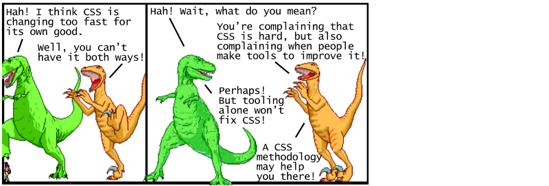
Using CSS methodologies for maintainability #
Tools like CSS preprocessors and CSS postprocessors go a long way towards improving the CSS development experience. But these tools alone aren’t enough to solve the problem of maintaining large CSS codebases. To address this, people began to document different guidelines on how to write CSS, generally referred to as CSS methodologies.
Before we dive into any particular CSS methodology, it’s important to understand what makes CSS hard to maintain over time. The key issue is the global nature of CSS — every style you define is globally applied to every part of the page. It becomes your job to either come up with a detailed naming convention to maintain unique class names or wrangle with specificity rules to determine which style gets applied any given element. CSS methodologies provide an organized way to write CSS in order to avoid these pain points with large code bases. Let’s take a look at some of the popular methodologies in rough chronological order.
OOCSS #
OOCSS (Object Oriented CSS) was first presented in 2009 as a methodology organized around two main principles. The first principle is separate structure and skin. This means the CSS to define the structure (like layout) shouldn’t be mixed together with the CSS to define the skin (like colors, fonts, etc.). This makes it easier to “re-skin” an application. The second principle is separate container and content. This means think of elements as re-usable objects, with the key idea being that an object should look the same regardless of where it is on the page.
OOCSS provides well thought out guidelines, but isn’t very prescriptive on the specifics of the approach. Later approaches like SMACSS took the core concepts and added more detail to make it easier to get started.
SMACSS #
SMACSS (Scalable and Modular Architecture for CSS) was introduced in 2011 as a methodology based around writing your CSS in 5 distinct categories — base rules, layout rules, modules, state rules, and theme rules. The SMACSS methodology also recommends some naming conventions. For layout rules, you would prefix class names with l- or layout-. For state rules, you would prefix class names that describe the state, like is-hidden or is-collapsed.
SMACSS has a lot more specifics in its approach compared to OOCSS, but it still requires some careful thought in deciding what CSS rules should go into which category. Later approaches like BEM took away some of this decision making to make it even easier to adopt.
BEM #
BEM (Block, Element, Modifier) was introduced in 2010 as a methodology organized around the idea of dividing the user interface into independent blocks. A block is a re-usable component (an example would be a search form, defined as <form class="search-form"></form>). An element is a smaller part of a block that can’t be re-used on its own (an example would be a button within the search form, defined as <button class="search-form__button">Search</button>). A modifier is an entity that defines the appearance, state, or behavior of a block or element (an example would be a disabled search form button, defined as <button class="search-form__button search-form__button--disabled">Search</button>).
The BEM methodology is simple to understand, with a specific naming convention that allows newcomers to apply it without having to make complex decisions. The downside for some is that the class names can be quite verbose, and don’t follow traditional rules for writing semantic class names. Later approaches like Atomic CSS would take this untraditional approach to a whole other level!
Atomic CSS #
Atomic CSS (also known as Functional CSS) was introduced in 2014 as a methodology organized around the idea of creating small, single-purpose classes with names based on visual function. This approach is in complete opposition with OOCSS, SMACSS, and BEM — instead of treating elements on the page as re-usable objects, Atomic CSS ignores these objects altogether and uses re-usable single purpose utility classes to style each element. So instead of something like <button class="search-form__button">Search</button>, you would have something like <button class="f6 br3 ph3 pv2 white bg-purple hover-bg-light-purple">Search</button>.
If your first reaction to this example is to recoil in horror, you’re not alone — many people saw this methodology as a complete violation of established CSS best practices. However, there has been a lot of excellent discussion around the idea of questioning the effectiveness of those best practices in different scenarios. This article does a great job highlighting how traditional separation of concerns ends up creating CSS that depends on the HTML (even when using methodologies like BEM), while an atomic or functional approach is about creating HTML that depends on the CSS. Neither is wrong, but upon close inspection you can see that a true separation of concerns between CSS and HTML is never fully achievable!
Other CSS methodologies like CSS in JS actually embrace the notion that CSS and HTML will always depend on each other, leading to one of the most controversial methodologies yet…
CSS in JS #
CSS in JS was introduced in 2014 as a methodology organized around defining CSS styles not in a separate style sheet, but directly in each component itself. It was introduced as an approach for the React JavaScript framework (which already took the controversial approach of defining the HTML for a component directly in JavaScript instead of a separate HTML file). Originally the methodology used inline styles, but later implementations used JavaScript to generate CSS (with unique class names based on the component) and insert it into the document with a style tag.
The CSS in JS methodology once again goes completely against established CSS best practices of separation of concerns. This is because the way we use the web has shifted dramatically over time. Originally the web largely consisted of static web sites — here the separation of HTML content from CSS presentation makes a lot of sense. Nowadays the web is used for creating dynamic web applications — here it makes sense to separate things out by re-usable components.
The goal of the CSS in JS methodology is to be able to define components with hard boundaries that consist of their own encapsulated HTML/CSS/JS, such that the CSS in one component has no chance of affecting any other components. React was one of the first widely adopted frameworks that pushed for these components with hard boundaries, influencing other major frameworks like Angular, Ember, and Vue.js to follow suit. It’s important to note that the CSS in JS methodology is relatively new, and there’s a lot of experimentation going on in this space as developers try to establish new best practices for CSS in the age of components for web applications.
It’s easy to get overwhelmed by the many different CSS methodologies that are out there, but it’s important to keep in mind that there is no one right approach — you should think of them as different possible tools you can use when you have a sufficiently complex CSS codebase. Having different well-thought-out options to choose from works in your favor, and all the recent experimentation happening in this space benefits every developer in the long run!
Conclusion #
So this is modern CSS in a nutshell. We covered using CSS for basic styling with typographic properties, using CSS for layout using float, flexbox, and grid based approaches, using a CSS preprocessor for new syntax such as variables and mixins, using a CSS postprocessor for transformative features such as adding vendor prefixes, and using CSS methodologies for maintainability to overcome the global nature of CSS styles. We didn’t get a chance to dig into a lot of other features CSS has to offer, like advanced selectors, transitions, animations, shapes, dynamic variables — the list goes on and on. There’s a lot of ground to cover with CSS — anyone who says it’s easy probably doesn’t know the half of it!
Modern CSS can definitely be frustrating to work with as it continues to change and evolve at a rapid pace. But it’s important to remember the historical context of how the web has evolved over time, and it’s good to know that there are a lot of smart people out there willing to build concrete tools and methodologies to help CSS best practices evolve right along with the web. It’s an exciting time to be a developer, and I hope this information can serve as a roadmap to help you on your journey!
Special thanks again to @ryanqnorth’s Dinosaur Comics, which has served up some of the finest absurdist humor since 2003 (when dinosaurs ruled the web).