Modern HTML Explained For Dinosaurs

Images from Dinosaur Comics by Ryan North
Out of the three main frontend technologies (HTML, CSS, and JavaScript), HTML has remained the most consistent. If your only concern was creating content, an HTML document from the 1990s would look pretty similar to one created in 2018:
<!DOCTYPE html>
<html>
  <head>
    <meta charset="utf-8">
    <title>My test page</title>
  </head>
  <body>
    <h1>Hello there!</h1>
  </body>
</html>
You have elements with tags and content, tags with attributes — other than the simplified doctype on the first line, not much has changed! However, over the years web development has taken a dramatic shift from creating static web sites (with a focus on content) to creating dynamic web applications (with a focus on interaction)— something the web wasn’t originally designed to do. Creating custom user interfaces that are still semantic and accessible, improving performance using attributes and tooling, organizing code for reuse and maintainability — there are now a whole new set of concerns at play.
The goal of this article is to provide a historical context of how HTML has evolved to the language it is today in 2018. We’ll start with the fundamentals of well structured and accessible HTML, just like the dinosaurs of old. Then we’ll introduce different techniques to improve performance, responsiveness, and maintainability. CSS and JavaScript will inevitably make its way into this conversation; for the purposes of this article, they will be covered from the perspective of how they impact the writing of HTML itself. By understanding this history, you will be able to take full advantage of both old and new features of the language that can often be overlooked. Let’s get started!
Writing content with semantic elements #
Let’s add some more content to the earlier HTML example. For now we’ll make a basic website with a navigation section with links and a search input, a large showcase section for displaying general site info (often referred to as a hero section or jumbotron), three column sections for articles, and a footer section for copyright info.
<!DOCTYPE html>
<html>
  <head>
    <meta charset="utf-8">
    <title>My test page</title>
  </head>
  <body>
    <div class="navbar">
      <ul>
        <li>
          <a href="#">Home</a>
        </li>
        <li>
          <a href="#">Info</a>
        </li>
        <li>
          <a href="#">About</a>
        </li>
      </ul>
      <form>
        <input type="text" placeholder="Search">
        <button type="submit">Search</button>
      </form>
    </div>
    <div class="main">
      <div class="hero">
        <h1>Hello there!</h1>
        <p>General info about the page goes here</p>
        <p><a href="#">Learn more</a></p>
      </div>
      <div class="grid">
        <div class="column">
          <h2>First Heading</h2>
          <p>Article content goes here</p>
          <p><a href="#">View details</a></p>
        </div>
        <div class="column">
          <h2>Second Heading</h2>
          <p>Article content goes here</p>
          <p><a href="#">View details</a></p>
        </div>
        <div class="column">
          <h2>Third Heading</h2>
          <p>Article content goes here</p>
          <p><a href="#">View details</a></p>
        </div>
      </div>
    </div>
    <div class="footer">
      <p>Copyright info goes here</p>
    </div>
  </body>
</html>
Here we’re using basic elements with tags like <div>, <h1>, <h2>, <p>, etc., to mark the content. The HTML here works, but it’s not fully semantic — that is to say, the tags do not communicate the meaning of the content as well as they could.
When HTML5 was introduced in 2008, it provided new elements to improve document semantics. Here’s an attempt to make the HTML more semantic:
<!DOCTYPE html>
<html lang="en">
  <head>
    <meta charset="utf-8">
    <meta name="viewport" content="width=device-width, initial-scale=1, shrink-to-fit=no">
    <meta name="description" content="">
    <meta name="author" content="">
    <title>My test page</title>
      <!--[if lt IE 9]>
        <script src="(https://cdnjs.cloudflare.com/ajax/libs/html5shiv/3.7.3/html5shiv.js"></script>
      <![endif]-->
  </head>
  <body>
    <nav role="navigation">
      <ul>
        <li>
          <a href="#">Home</a>
        </li>
        <li>
          <a href="#">Info</a>
        </li>
        <li>
          <a href="#">About</a>
        </li>
      </ul>
      <form>
        <input type="text" placeholder="Search">
        <button type="submit">Search</button>
      </form>
    </nav>
    <main role="main">
      <section class="hero">
        <h1>Hello there!</h1>
        <p>General info about the page goes here</p>
        <p><a href="#">Learn more</a></p>
      </section>
      <section class="grid">
        <article class="column">
          <h2>First Heading</h2>
          <p>Article content goes here</p>
          <p><a href="#">View details</a></p>
        </article>
        <article class="column">
          <h2>Second Heading</h2>
          <p>Article content goes here</p>
          <p><a href="#">View details</a></p>
        </article>
        <article class="column">
          <h2>Third Heading</h2>
          <p>Article content goes here</p>
          <p><a href="#">View details</a></p>
        </article>
      </section>
    </main>
    <footer role="contentinfo">
      <p>Copyright info goes here</p>
    </footer>
  </body>
</html>
Let’s examine some of the these changes:
- The
<html lang="en">specifies the language of the document, which helps search engines and browsers identify the appropriate content. - The additional
<meta>tags provides information about the site not directly visible on page, used by search engines and other services. They also provide information about how to size the content on different devices. - The
<nav>,<main>,<section>,<article>, and<footer>tags provide more accessible structure to the HTML document (compared to generic<div>tags). These tags were introduced with HTML5. - The
<!-- [if lt IE 9]>...-->comment adds a JavaScript file that only gets loaded for older versions of Internet Explorer, since they don’t support the above HTML5 tags. Note that many recent websites don’t include that comment these days, as fewer sites support those browsers. - The
roleattributes provide accessibility information as well. Note that using a<nav>tag generally is enough for accessibility, adding the extrarole="navigation"is used in case the<nav>tag isn’t recognized.
Writing semantic HTML can seem unimportant, especially when it doesn’t affect the visual appearance of a website. However, your website is being viewed by more than just human beings — web browsers, search engines, screen readers all depend on semantic HTML to function properly.
Improving accessibility with WAI-ARIA attributes #
Let’s look at the search input in the navbar from our example above:
      <form>
        <input type="text" placeholder="Search">
        <button type="submit">Search</button>
      </form>
This input element uses a placeholder attribute instead of a label element to let the user know its purpose. This works for humans, but it’s not properly semantic HTML, and can be missed by screen readers and other technologies. The way to make this accessible is to use an aria-label attribute:
      <form>
        <input type="text" placeholder="Search" aria-label="Search">
        <button type="submit">Search</button>
      </form>
WAI-ARIA, which stands for “Web Accessibility Initiative — Accessible Rich Internet Applications” (often simply ARIA for short), is a set of attributes that makes HTML more accessible when semantic tags aren’t enough. The role attribute seen in the previous section is an ARIA attribute. So far these attributes seem like minor changes, but it becomes much more important as we use HTML for things beyond basic documents.
Let’s look at a more complex example — say we want to add some tabbed content in our HTML to provide instructions on how to install some program on Windows, Mac, and Linux. Since there’s no native way of building tabs in HTML, we have to make do with things like unordered lists, links, and divs to construct our own tab markup. Here we can use accessibility attributes such as role, aria-controls, aria-selected, and aria-labelledby to mark up the HTML, as seen below:
<ul role="tablist">
  <li>
    <a id="windows-tab" href="#windows" role="tab" aria-controls="windows" aria-selected="true">Windows</a>
  </li>
  <li>
    <a id="mac-tab" href="#mac" role="tab" aria-controls="mac" aria-selected="false">Mac</a>
  </li>
  <li>
    <a id="linux-tab" href="#linux" role="tab" aria-controls="linux" aria-selected="false">Linux</a>
  </li>
</ul>

<div>
  <div id="windows" role="tabpanel" aria-labelledby="windows-tab">
    <img src="http://1000logos.net/wp-content/uploads/2017/04/Microsoft-Logo.png" alt="microsoft logo">
    ...
  </div>
  <div id="mac" role="tabpanel" aria-labelledby="mac-tab">
    <img src="https://i.ytimg.com/vi/ipOzBWuYZvg/maxresdefault.jpg" alt="apple logo">
    ...
  </div>
  <div id="linux" role="tabpanel" aria-labelledby="linux-tab">
    <img src="https://noware.tech/wp-content/uploads/sites/140/2018/04/linux-1024x565.jpg" alt="linux logo">
    ...
  </div>
</div>
Without these accessibility attributes, the tabbed content would have no discernible relationship with the tab controls. Having these attributes helps screen readers identify content, enables keyboard shortcuts with proper tabbing, etc. Using appropriate ARIA attributes can be a whole study in and of itself — for a deeper dive, check out the official guidelines.
All this may seem like a lot of work just to improve the accessibility of a website. It’s important to acknowledge accessibility as an integral part of the web, which was designed as a platform to freely share information with everyone, not just a select few. Making a website accessible improves the experience for every visitor — for example, accessible keyboard shortcuts help those who can never use a mouse, those who temporarily can’t use a mouse, and those who prefer to not use a mouse (a.k.a., most programmers). Accessibility can be easy to overlook when dealing with other features, but it should not be ignored.
If you’re interested in improving the accessibility of your website, there are checklists such as this one from the A11Y project, which is a great place to start. However, making a website accessible isn’t purely about checking off items — it’s something that can always be improved, like any aspect of user experience. The best way to make your website accessible is to actually use your website as different people in your audience would — test it out using a screen reader, try only using a keyboard instead of a mouse, view your website using a color blind filter, etc.
Making it pretty with CSS and JavaScript #
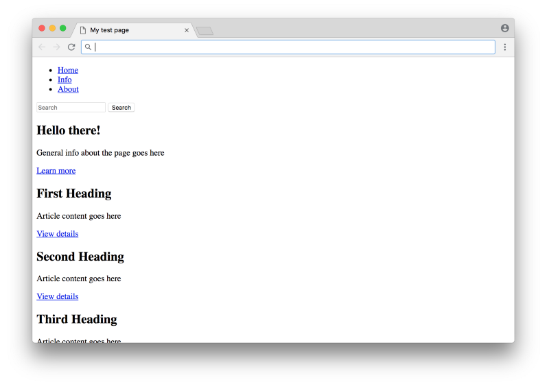
If we take a look at the website so far, it looks pretty bare as you would expect:
In order to spruce it up, we’ll add a CSS file to apply styling. Now if you’re not particularly good at CSS, it could take you many days to make this website look pretty. Instead of writing your own CSS, you could always use a CSS framework, which is essentially CSS that someone else wrote in a reusable manner.
One popular CSS framework is Bootstrap, which came out in 2011 and quickly became adopted and used by literally millions of websites. Let’s see what some of the code would look like using Bootstrap:
<!DOCTYPE html>
<html lang="en">
  <head>
    <meta charset="utf-8">
    <meta name="viewport" content="width=device-width, initial-scale=1, shrink-to-fit=no">
    <meta name="description" content="">
    <meta name="author" content="">
    <title>My test page</title>
    <link rel="stylesheet" href="https://stackpath.bootstrapcdn.com/bootstrap/4.1.3/css/bootstrap.min.css" integrity="sha384-MCw98/SFnGE8fJT3GXwEOngsV7Zt27NXFoaoApmYm81iuXoPkFOJwJ8ERdknLPMO" crossorigin="anonymous">
    <!--[if lt IE 9]>
      <script src="https://cdnjs.cloudflare.com/ajax/libs/html5shiv/3.7.3/html5shiv.js"></script>
    <![endif]-->
  </head>
  <body>
    <nav class="navbar navbar-expand-lg navbar-light bg-light" role="navigation">
      <ul class="navbar-nav mr-auto">
        <li class="nav-item active">
          <a class="nav-link" href="#">Home</a>
        </li>
        <li class="nav-item">
          <a class="nav-link" href="#">Info</a>
        </li>
        <li class="nav-item">
          <a class="nav-link" href="#">About</a>
        </li>
      </ul>
      <form class="form-inline my-2 my-lg-0">
        <input class="form-control mr-sm-2" type="text" placeholder="Search" aria-label="Search">
        <button class="btn btn-outline-success my-2 my-sm-0" type="submit">Search</button>
      </form>
    </nav>
    <main role="main">
      <!-- ... -->
    </main>
    <footer class="navbar navbar-dark bg-secondary" role="contentinfo">
      <p>Copyright info goes here</p>
    </footer>
  </body>
</html>
You can see the full code example here.
Let’s examine the changes:
- The
<link>in the<head>tag adds the Bootstrap CSS to our site. Note that we’re linking to a file that’s hosted online, which can open up some security risks — theintegrityandcrossoriginattributes help ensure the file being linked to is correct. - The classes that were added are all specific to Bootstrap — the Bootstrap CSS that was added has styles which target those specific class names with the specific HTML structure.
- One extra
<div class="row">was added to surround the three articles to take advantage of Bootstrap’s grid layout system (which uses this specific HTML structure).
Here’s what the site looks like now:
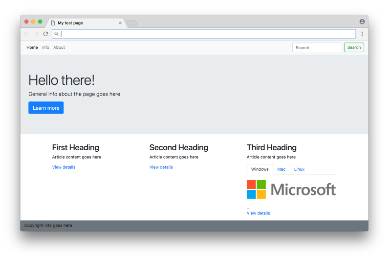
Not bad! Note that in order to use a CSS framework like Bootstrap, you actually don’t need to write any CSS at all to get started — you just need to add the appropriate classes to the HTML to take advantage of the CSS that comes with the framework.
One thing to note here is that while the tabs are styled properly (only one tab is visible at any moment), they don’t work properly yet — clicking on a tab doesn’t do anything. That’s because in this case this type of custom interaction isn’t handled by CSS — it’s handled by JavaScript. In this case, we can get the Bootstrap tabs to work by adding the JavaScript files that comes with the Bootstrap framework in the <head> tag:
<script src="https://code.jquery.com/jquery-3.3.1.slim.min.js" integrity="sha384-q8i/X+965DzO0rT7abK41JStQIAqVgRVzpbzo5smXKp4YfRvH+8abtTE1Pi6jizo" crossorigin="anonymous"></script>

<script src="https://cdnjs.cloudflare.com/ajax/libs/popper.js/1.14.3/umd/popper.min.js" integrity="sha384-ZMP7rVo3mIykV+2+9J3UJ46jBk0WLaUAdn689aCwoqbBJiSnjAK/l8WvCWPIPm49" crossorigin="anonymous"></script>

<script src="https://stackpath.bootstrapcdn.com/bootstrap/4.1.3/js/bootstrap.min.js" integrity="sha384-ChfqqxuZUCnJSK3+MXmPNIyE6ZbWh2IMqE241rYiqJxyMiZ6OW/JmZQ5stwEULTy" crossorigin="anonymous"></script>
The last script is Bootstrap’s JavaScript. The first two are dependencies that Bootstrap uses (jQuery and Popper), which must be loaded first before the Bootstrap script is loaded. If you check out this live example, you can see that the tabs now work!
Bootstrap became widely used because it helped with the major pain points of CSS at the time, such as browser inconsistencies and a lack of a proper grid system. There are some downsides of using CSS frameworks like Bootstrap — in particular, they can be difficult to customize compared to writing CSS from scratch, which can make your website seem generic compared to others.
Also, with the rise of smartphones and mobile traffic, reducing CSS and JS file sizes became increasingly important — anything above a few kilobytes can significantly affect performance on slower internet connections. The way we’re using Bootstrap in the above example, we’re requiring the user to download the entire Bootstrap framework with the site, even though we’re only using a couple of styles and features. In the next section, we’ll take a look at several techniques to help tackle these performance issues.
Note: A solid grasp of CSS and JavaScript is intrinsically linked to making sophisticated websites with HTML; however, a deep dive into these languages is outside the scope of this article. If you’d like to learn more about the fundamentals of CSS and JavaScript, the MDN Web Docs are always a good place to start. If you want to get a better understanding of how all the newer features of CSS (flexbox, grid, SASS, etc.) fit together with all the tooling and techniques involved with it, check out my article Modern CSS Explained For Dinosaurs.

Improving performance with HTML attributes #
At this point we have a website with reasonably well organized, semantic HTML. And if this is all we are considering, then our website would be done! Yet there are many areas where the site can be improved, in terms of both performance (how quickly the website loads for a user) and maintainability (how easy the code is to change for a developer).
The defer attribute for scripts #
For our website, one major optimization is to address the JavaScript files that are being loaded in the header. These files are large enough to actually slow down the website. In order to render a page, a web browser reads the given HTML and converts it into a format it understands — the Document Object Model, or DOM. As you might expect, a web browser starts at the top of the HTML document and works its way down. That means if it sees a <script> tag, it will download and execute the script before moving on to the next line. You can see an illustration of this process here:
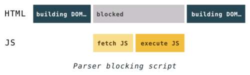
(From hacks.mozilla.org)
A common optimization hack is to move all JavaScript <script> tags out of the <head> tag and into the end of the <body> tag. You can see this in Bootstrap’s own starter template:
<!doctype html>
<html lang="en">
  <head>
    <!-- Required meta tags -->
    <meta charset="utf-8">
    <meta name="viewport" content="width=device-width, initial-scale=1, shrink-to-fit=no">    <!-- Bootstrap CSS -->
    <link rel="stylesheet" href="https://stackpath.bootstrapcdn.com/bootstrap/4.1.3/css/bootstrap.min.css" integrity="sha384-MCw98/SFnGE8fJT3GXwEOngsV7Zt27NXFoaoApmYm81iuXoPkFOJwJ8ERdknLPMO" crossorigin="anonymous">    <title>Hello, world!</title>
  </head>
  <body>
    <h1>Hello, world!</h1>    <!-- Optional JavaScript -->
    <!-- jQuery first, then Popper.js, then Bootstrap JS -->
    <script src="https://code.jquery.com/jquery-3.3.1.slim.min.js" integrity="sha384-q8i/X+965DzO0rT7abK41JStQIAqVgRVzpbzo5smXKp4YfRvH+8abtTE1Pi6jizo" crossorigin="anonymous"></script>
    <script src="https://cdnjs.cloudflare.com/ajax/libs/popper.js/1.14.3/umd/popper.min.js" integrity="sha384-ZMP7rVo3mIykV+2+9J3UJ46jBk0WLaUAdn689aCwoqbBJiSnjAK/l8WvCWPIPm49" crossorigin="anonymous"></script>
    <script src="https://stackpath.bootstrapcdn.com/bootstrap/4.1.3/js/bootstrap.min.js" integrity="sha384-ChfqqxuZUCnJSK3+MXmPNIyE6ZbWh2IMqE241rYiqJxyMiZ6OW/JmZQ5stwEULTy" crossorigin="anonymous"></script>
  </body>
</html>
This a optimization is a hack in the sense that this isn’t how HTML was designed to be organized — CSS and JavaScript files are meant to be defined in the <head> tag as seen earlier. However, keeping everything in the <head> tag creates the unintentional side effect of slowing page rendering performance. Moving all <script> tags to the bottom of the <body> tag is one way to improve performance.
In 2018, many websites still use this trick of moving all <script> tags to the bottom of the <body> tag. However, there is a less hacky approach that has been supported by browsers for nearly 10 years — the defer attribute. By adding this attribute to a <script> tag, the browser will download the external file without blocking the rest of the DOM from being built, and will execute the script after the DOM building is complete. You can see an illustration of this process here:
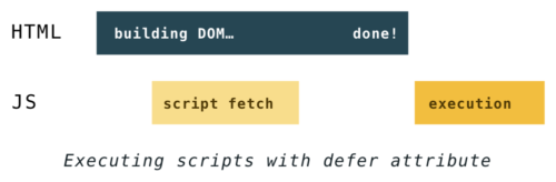
(From hacks.mozilla.org)
In many cases, keeping <script> tags in the <head> with a defer attribute would result in faster loading pages, since the files can be downloaded in parallel with the DOM being built. This is what Bootstrap’s starter template would look like using the defer attribute instead:
<!doctype html>
<html lang="en">
  <head>
    <!-- Required meta tags -->
    <meta charset="utf-8">
    <meta name="viewport" content="width=device-width, initial-scale=1, shrink-to-fit=no">    <!-- Bootstrap CSS -->
    <link rel="stylesheet" href="https://stackpath.bootstrapcdn.com/bootstrap/4.1.3/css/bootstrap.min.css" integrity="sha384-MCw98/SFnGE8fJT3GXwEOngsV7Zt27NXFoaoApmYm81iuXoPkFOJwJ8ERdknLPMO" crossorigin="anonymous">    <!-- Optional JavaScript -->
    <!-- jQuery first, then Popper.js, then Bootstrap JS -->
    <script defer src="https://code.jquery.com/jquery-3.3.1.slim.min.js" integrity="sha384-q8i/X+965DzO0rT7abK41JStQIAqVgRVzpbzo5smXKp4YfRvH+8abtTE1Pi6jizo" crossorigin="anonymous"></script>
    <script defer src="https://cdnjs.cloudflare.com/ajax/libs/popper.js/1.14.3/umd/popper.min.js" integrity="sha384-ZMP7rVo3mIykV+2+9J3UJ46jBk0WLaUAdn689aCwoqbBJiSnjAK/l8WvCWPIPm49" crossorigin="anonymous"></script>
    <script defer src="https://stackpath.bootstrapcdn.com/bootstrap/4.1.3/js/bootstrap.min.js" integrity="sha384-ChfqqxuZUCnJSK3+MXmPNIyE6ZbWh2IMqE241rYiqJxyMiZ6OW/JmZQ5stwEULTy" crossorigin="anonymous"></script>    <title>Hello, world!</title>
  </head>
  <body>
    <h1>Hello, world!</h1>
  </body>
</html>
The benefit here is that the website would render faster, and it keeps the HTML organized with scripts in the <head> tag as intended. For more fine tuned control over what files get downloaded and executed in what order, there is also the async attribute as well as the rel="preload" attribute for <link> tags (which you can read more about here).
The srcset attribute for images #
For our website, one other major performance optimization would be the images. Right now the images are being “hotlinked”, which means they are being directly linked off someone else’s website. Not only is this problematic from a maintenance perspective (if the other person ever changes their image it will break our website), it can also be problematic from a performance perspective.
Instead of directly linking the files, we can download the files and link to them locally. Furthermore, we can optimize the image file sizes by resizing them to an appropriate resolution. Instead of this image tag which directly links to a single image on another website:
<img
  class="img-fluid"
  src="http://1000logos.net/wp-content/uploads/2017/04/Microsoft-Logo.png"
  alt="microsoft logo"
>
We can create multiple versions of the image locally and link to them responsively:
<img
  class="img-fluid"
  src="microsoft-logo-small.png"
  srcset="microsoft-logo-medium.png 1000w, microsoft-logo-large.png 2000w"
  alt="microsoft logo"
>
Here we’re using a small, medium, and large version of the logo. The srcset attribute tells the browser to load the appropriate version based on the browser width. The srcset attribute was introduced around 2013, but it took several years for browsers to fully support it. As of 2018 it has pretty decent browser support, so it’s definitely worth making part of your workflow.
Optimizing image sizes is often the largest performance gain for many websites — image download sizes are often orders of magnitude larger than any JavaScript and CSS files. You can get even finer control over images with the <picture> element; however, using simple srcset attributes is often more than enough for most use cases.
Other HTML attributes #
As a language, HTML has many attributes and continues to add new ones that can be used to improve performance (like importance and lazyload). While it can be daunting, focusing on the largest resources in terms of download size (images and scripts), whatever they may be for your particular website, is usually the best place to start.
Note that just like accessibility, there is no blanket set of performance rules that will always work for every website — you should benchmark your website to determine what works best (browsers such as Chrome and Firefox provide such tools). Again, the best approach is to simply use your website with slow network conditions (which browser’s dev tools can simulate) — if you use your own website for even just a week under slow network conditions, you’re likely to find a multitude of performance fixes to improve its experience.
Improving performance with tooling #
So far we’ve been using the tools that the HTML language provides for optimizing performance. You can also use external tools for even more performance benefits. Let’s take a look at several commonly used approaches.
Code minification #
One important performance optimization is minification (sometimes referred to as uglification) of your JavaScript and CSS code. This involves using a program to analyze and remove unnecessary or redundant data from your code, from simple things like removing unneeded spaces to complex things like renaming long variables to single characters when possible. Here’s an example from the first JavaScript minifier released in 2003 by Douglas Crockford. The sample unminified code looks like this:
// is.js

// (c) 2001 Douglas Crockford
// 2001 June 3


// is

// The -is- object is used to identify the browser.  Every browser edition
// identifies itself, but there is no standard way of doing it, and some of
// the identification is deceptive. This is because the authors of web
// browsers are liars. For example, Microsoft's IE browsers claim to be
// Mozilla 4. Netscape 6 claims to be version 5.

var is = {
    ie:      navigator.appName == 'Microsoft Internet Explorer',
    java:    navigator.javaEnabled(),
    ns:      navigator.appName == 'Netscape',
    ua:      navigator.userAgent.toLowerCase(),
    version: parseFloat(navigator.appVersion.substr(21)) ||
             parseFloat(navigator.appVersion),
    win:     navigator.platform == 'Win32'
}
is.mac = is.ua.indexOf('mac') >= 0;
if (is.ua.indexOf('opera') >= 0) {
    is.ie = is.ns = false;
    is.opera = true;
}
if (is.ua.indexOf('gecko') >= 0) {
    is.ie = is.ns = false;
    is.gecko = true;
}
And the code after minification looks like this:
var is={ie:navigator.appName=='Microsoft Internet Explorer',java:navigator.javaEnabled(),ns:navigator.appName=='Netscape',ua:navigator.userAgent.toLowerCase(),version:parseFloat(navigator.appVersion.substr(21))||parseFloat(navigator.appVersion),win:navigator.platform=='Win32'}
is.mac=is.ua.indexOf('mac')>=0;if(is.ua.indexOf('opera')>=0){is.ie=is.ns=false;is.opera=true;}
if(is.ua.indexOf('gecko')>=0){is.ie=is.ns=false;is.gecko=true;}
These changes do add up — from our earlier example, the unminified bootstrap.js has a size of 124 KB, whereas the minified bootstrap.min.js has a size of 51 KB. That’s less than half the original size — by Grabthar’s hammer, what a savings! But seriously, it makes a significant difference in terms of how quickly a website will download and display, especially on slower internet connections.
The Bootstrap CSS and JavaScript we’re using in our previous example is already minified, but if you want to minify your own code, you could use online tools such as JavaScript Minifier or Minify, there are plenty to choose from. Or you would use a command line tool, which saves you the process of copying your code into a website.
File concatenation #
Another related performance optimization is concatenation, which is converting multiple JavaScript files (or CSS files) into a single file. Browsers can download a single file faster than downloading multiple smaller files, based on the HTTP/1.1 protocol that browsers have used since 1999.
It’s important to note that the new version of the protocol, HTTP/2, was released in 2015 and potentially changes this optimization. HTTP/2 allows multiple simultaneous connections, so in theory it’s better to have multiple small files as opposed to one large concatenated file. However, in practice it doesn’t appear to be quite so simple, as there are still important benefits from concatenation. As of 2018, it is still common practice to concatenate JavaScript and CSS files.
To concatenate your files, you theoretically could do it manually — copy the contents of each JavaScript file into a single file, repeat for CSS files, etc. Then modify the HTML to link to the single concatenated JavaScript file and the single concatenated CSS file. You’d have to do this each time you deploy your app, which would be quite painful to maintain — it’s much more preferable to use some automated process (more on that below).
Critical CSS #
One more optimization popularized in recent years is inlining the critical CSS for a page. This involves using a tool to identify all the HTML elements that the user would first see when going to a web page:
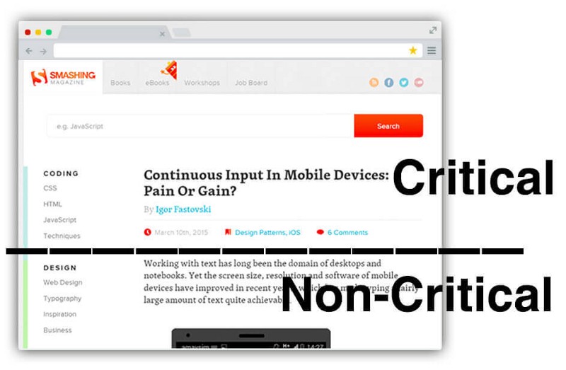
From https://www.smashingmagazine.com/2015/08/understanding-critical-css/
Once these HTML elements are identified, the tool would find all the CSS that affect those elements and add them directly to the HTML file. In this way, the browser is able to display a fully styled website without having to wait for the remaining CSS to download!
There are different tools that help you identify your critical CSS, from the node-based critical library by Addy Osmani to the web based Critical Path CSS Generator by Jonas Ohlsson Aden. Below is an example of what the HTML <head> element from our previous Bootstrap example would look like after being analyzed by the critical tool:
<!DOCTYPE html>
<html lang="en">
  <head>
    <meta charset="utf-8">
    <meta name="viewport" content="width=device-width, initial-scale=1, shrink-to-fit=no">
    <meta name="description" content="">
    <meta name="author" content="">
    <title>My test page</title>
    <style>
      :root{--blue:#007bff;--indigo:#6610f2;--purple:#6f42c1;--pink:#e83e8c;--red:#dc3545;--orange:#fd7e14;--yellow:#ffc107;--green:#28a745;--teal:#20c997;--cyan:#17a2b8;--white:#fff;--gray:#6c757d;--gray-dark:#343a40;--primary:#007bff;--secondary:#6c757d;--success:#28a745;--info:#17a2b8;--warning:#ffc107;--danger:#dc3545;--light:#f8f9fa;--dark:#343a40;--breakpoint-xs:0;--breakpoint-sm:576px;--breakpoint-md:768px;--breakpoint-lg:992px;--breakpoint-xl:1200px;--font-family-sans-serif:-apple-system,BlinkMacSystemFont,"Segoe UI",Roboto,"Helvetica Neue",Arial,sans-serif,"Apple Color Emoji","Segoe UI Emoji","Segoe UI Symbol","Noto Color Emoji";--font-family-monospace:SFMono-Regular,Menlo,Monaco,Consolas,"Liberation Mono","Courier New",monospace}\*,::after,::before{box-sizing:border-box}html{font-family:sans-serif;line-height:1.15;-webkit-text-size-adjust:100%;-ms-text-size-adjust:100%;-ms-overflow-style:scrollbar}@-ms-viewport{width:device-width}article,footer,main,nav,section{display:block}body{margin:0;font-family:-apple-system,BlinkMacSystemFont,"Segoe UI",Roboto,"Helvetica Neue",Arial,sans-serif,"Apple Color Emoji","Segoe UI Emoji","Segoe UI Symbol","Noto Color Emoji";font-size:1rem;font-weight:400;line-height:1.5;color:#212529;text-align:left;background-color:#fff}h1,h2{margin-top:0;margin-bottom:.5rem}p{margin-top:0;margin-bottom:1rem}ul{margin-top:0;margin-bottom:1rem}a{color:#007bff;text-decoration:none;background-color:transparent;-webkit-text-decoration-skip:objects}img{vertical-align:middle;border-style:none}button{border-radius:0}button,input{margin:0;font-family:inherit;font-size:inherit;line-height:inherit}button,input{overflow:visible}button{text-transform:none}[type=submit],button{-webkit-appearance:button}[type=submit]::-moz-focus-inner,button::-moz-focus-inner{padding:0;border-style:none}::-webkit-file-upload-button{font:inherit;-webkit-appearance:button}h1,h2{margin-bottom:.5rem;font-family:inherit;font-weight:500;line-height:1.2;color:inherit}h1{font-size:2.5rem}h2{font-size:2rem}.lead{font-size:1.25rem;font-weight:300}.display-4{font-size:3.5rem;font-weight:300;line-height:1.2}.img-fluid{max-width:100%;height:auto}.container{width:100%;padding-right:15px;padding-left:15px;margin-right:auto;margin-left:auto}[@media](http://twitter.com/media "Twitter profile for @media") (min-width:576px){.container{max-width:540px}}[@media](http://twitter.com/media "Twitter profile for @media") (min-width:768px){.container{max-width:720px}}[@media](http://twitter.com/media "Twitter profile for @media") (min-width:992px){.container{max-width:960px}}[@media](http://twitter.com/media "Twitter profile for @media") (min-width:1200px){.container{max-width:1140px}}.row{display:-ms-flexbox;display:flex;-ms-flex-wrap:wrap;flex-wrap:wrap;margin-right:-15px;margin-left:-15px}.col-4{position:relative;width:100%;min-height:1px;padding-right:15px;padding-left:15px}.col-4{-ms-flex:0 0 33.333333%;flex:0 0 33.333333%;max-width:33.333333%}.form-control{display:block;width:100%;height:calc(2.25rem + 2px);padding:.375rem .75rem;font-size:1rem;line-height:1.5;color:#495057;background-color:#fff;background-clip:padding-box;border:1px solid #ced4da;border-radius:.25rem}.form-control::-ms-expand{background-color:transparent;border:0}.form-control::-webkit-input-placeholder{color:#6c757d;opacity:1}.form-control::-moz-placeholder{color:#6c757d;opacity:1}.form-control:-ms-input-placeholder{color:#6c757d;opacity:1}.form-control::-ms-input-placeholder{color:#6c757d;opacity:1}.form-inline{display:-ms-flexbox;display:flex;-ms-flex-flow:row wrap;flex-flow:row wrap;-ms-flex-align:center;align-items:center}[@media](http://twitter.com/media "Twitter profile for @media") (min-width:576px){.form-inline .form-control{display:inline-block;width:auto;vertical-align:middle}}.btn{display:inline-block;font-weight:400;text-align:center;white-space:nowrap;vertical-align:middle;border:1px solid transparent;padding:.375rem .75rem;font-size:1rem;line-height:1.5;border-radius:.25rem}.btn-primary{color:#fff;background-color:#007bff;border-color:#007bff}.btn-outline-success{color:#28a745;background-color:transparent;background-image:none;border-color:#28a745}.btn-lg{padding:.5rem 1rem;font-size:1.25rem;line-height:1.5;border-radius:.3rem}.fade:not(.show){opacity:0}.nav{display:-ms-flexbox;display:flex;-ms-flex-wrap:wrap;flex-wrap:wrap;padding-left:0;margin-bottom:0;list-style:none}.nav-link{display:block;padding:.5rem 1rem}.nav-tabs{border-bottom:1px solid #dee2e6}.nav-tabs .nav-item{margin-bottom:-1px}.nav-tabs .nav-link{border:1px solid transparent;border-top-left-radius:.25rem;border-top-right-radius:.25rem}.nav-tabs .nav-link.active{color:#495057;background-color:#fff;border-color:#dee2e6 #dee2e6 #fff}.tab-content>.tab-pane{display:none}.tab-content>.active{display:block}.navbar{position:relative;display:-ms-flexbox;display:flex;-ms-flex-wrap:wrap;flex-wrap:wrap;-ms-flex-align:center;align-items:center;-ms-flex-pack:justify;justify-content:space-between;padding:.5rem 1rem}.navbar-nav{display:-ms-flexbox;display:flex;-ms-flex-direction:column;flex-direction:column;padding-left:0;margin-bottom:0;list-style:none}.navbar-nav .nav-link{padding-right:0;padding-left:0}[@media](http://twitter.com/media "Twitter profile for @media") (min-width:992px){.navbar-expand-lg{-ms-flex-flow:row nowrap;flex-flow:row nowrap;-ms-flex-pack:start;justify-content:flex-start}.navbar-expand-lg .navbar-nav{-ms-flex-direction:row;flex-direction:row}.navbar-expand-lg .navbar-nav .nav-link{padding-right:.5rem;padding-left:.5rem}}.navbar-light .navbar-nav .nav-link{color:rgba(0,0,0,.5)}.navbar-light .navbar-nav .active>.nav-link{color:rgba(0,0,0,.9)}.jumbotron{padding:2rem 1rem;margin-bottom:2rem;background-color:#e9ecef;border-radius:.3rem}[@media](http://twitter.com/media "Twitter profile for @media") (min-width:576px){.jumbotron{padding:4rem 2rem}}.bg-secondary{background-color:#6c757d!important}.bg-light{background-color:#f8f9fa!important}.my-2{margin-top:.5rem!important}.my-2{margin-bottom:.5rem!important}.mr-auto{margin-right:auto!important}[@media](http://twitter.com/media "Twitter profile for @media") (min-width:576px){.my-sm-0{margin-top:0!important}.my-sm-0{margin-bottom:0!important}.mr-sm-2{margin-right:.5rem!important}}[@media](http://twitter.com/media "Twitter profile for @media") (min-width:992px){.my-lg-0{margin-top:0!important}.my-lg-0{margin-bottom:0!important}}
    </style>
    <link rel="preload" href="[https://stackpath.bootstrapcdn.com/bootstrap/4.1.3/css/bootstrap.min.css](https://stackpath.bootstrapcdn.com/bootstrap/4.1.3/css/bootstrap.min.css)" integrity="sha384-MCw98/SFnGE8fJT3GXwEOngsV7Zt27NXFoaoApmYm81iuXoPkFOJwJ8ERdknLPMO" crossorigin="anonymous" as="style" onload="this.onload=null;this.rel='stylesheet'">
    <noscript><link rel="stylesheet" href="[https://stackpath.bootstrapcdn.com/bootstrap/4.1.3/css/bootstrap.min.css](https://stackpath.bootstrapcdn.com/bootstrap/4.1.3/css/bootstrap.min.css)" integrity="sha384-MCw98/SFnGE8fJT3GXwEOngsV7Zt27NXFoaoApmYm81iuXoPkFOJwJ8ERdknLPMO" crossorigin="anonymous"></noscript>
    <script>!function(n){"use strict";n.loadCSS||(n.loadCSS=function(){});var o=loadCSS.relpreload={};if(o.support=function(){var e;try{e=n.document.createElement("link").relList.supports("preload")}catch(t){e=!1}return function(){return e}}(),o.bindMediaToggle=function(t){var e=t.media||"all";function a(){t.media=e}t.addEventListener?t.addEventListener("load",a):t.attachEvent&&t.attachEvent("onload",a),setTimeout(function(){t.rel="stylesheet",t.media="only x"}),setTimeout(a,3e3)},o.poly=function(){if(!o.support())for(var t=n.document.getElementsByTagName("link"),e=0;e<t.length;e++){var a=t[e];"preload"!==a.rel||"style"!==a.getAttribute("as")||a.getAttribute("data-loadcss")||(a.setAttribute("data-loadcss",!0),o.bindMediaToggle(a))}},!o.support()){o.poly();var t=n.setInterval(o.poly,500);n.addEventListener?n.addEventListener("load",function(){o.poly(),n.clearInterval(t)}):n.attachEvent&&n.attachEvent("onload",function(){o.poly(),n.clearInterval(t)})}"undefined"!=typeof exports?exports.loadCSS=loadCSS:n.loadCSS=loadCSS}("undefined"!=typeof global?global:this);</script>
    <script defer src="[https://code.jquery.com/jquery-3.3.1.slim.min.js](https://code.jquery.com/jquery-3.3.1.slim.min.js)" integrity="sha384-q8i/X+965DzO0rT7abK41JStQIAqVgRVzpbzo5smXKp4YfRvH+8abtTE1Pi6jizo" crossorigin="anonymous"></script>
    <script defer src="[https://cdnjs.cloudflare.com/ajax/libs/popper.js/1.14.3/umd/popper.min.js](https://cdnjs.cloudflare.com/ajax/libs/popper.js/1.14.3/umd/popper.min.js)" integrity="sha384-ZMP7rVo3mIykV+2+9J3UJ46jBk0WLaUAdn689aCwoqbBJiSnjAK/l8WvCWPIPm49" crossorigin="anonymous"></script>
    <script defer src="[https://stackpath.bootstrapcdn.com/bootstrap/4.1.3/js/bootstrap.min.js](https://stackpath.bootstrapcdn.com/bootstrap/4.1.3/js/bootstrap.min.js)" integrity="sha384-ChfqqxuZUCnJSK3+MXmPNIyE6ZbWh2IMqE241rYiqJxyMiZ6OW/JmZQ5stwEULTy" crossorigin="anonymous"></script>
    <!--[if lt IE 9]>
      <script src="[https://cdnjs.cloudflare.com/ajax/libs/html5shiv/3.7.3/html5shiv.js](https://cdnjs.cloudflare.com/ajax/libs/html5shiv/3.7.3/html5shiv.js)"></script>
    <![endif]-->
  </head>
  <body>
     <!-- ...  -->
  </body>
</html>
As you can see, the tool added an inline <style> element with a lot of CSS. Note that this isn’t all of Bootstrap’s CSS, just the CSS that the tool analyzed was necessary for the initial view of this page. Bootstrap’s minified CSS alone is 51 KB; this new HTML file, which includes all the HTML plus the newly inlined CSS and JavaScript, is 12 KB. This decreased size is more important than it may seem — getting your initial HTML/CSS/JS under 14 KB can enable your site to render in milliseconds on some of the slowest of connections. This is because each round trip between a browser and a server can send about 14 KB at a time — by fitting everything into a single round trip, you can avoid the overhead of additional round trips (more detailed info here).
The tool also added a rel="preload" attribute on the CSS link element, which enables the CSS file to be loaded asynchronously. This is normally something you don’t want to do — although it would speed up the site, the user would see the unstyled plain HTML first, then see the properly styled site a few moments later when the CSS file is loaded. However, in our case, since we’re inlining the critical CSS, this isn’t an issue, so loading the remaining CSS asynchronously works perfectly!
Implementing a build step #
At this point you could do things like manually minify and concatenate your files each time you deploy your website, but it would be a huge pain. Ideally you would automate this set of tasks with a single command, which is known as a build step. Minification and concatenation are just two of the possible tasks — there can be tasks for anything repetitive that can be automated. Here are some typical tasks in a build step:
- Minify the HTML, CSS, and JavaScript
- Concatenate JavaScript files and CSS files
- Inline critical CSS
- Optimize images (by resizing, removing unused metadata, etc.)
- Add CSS vendor prefixes for browser compatibility
- Transpiling code (from SASS to CSS, or CoffeeScript to JS, etc.)
- Run code testing
To implement a build step, you’ll need to pick a tool, and there are many to choose from. One popular choice was Grunt, which was released in 2012. It was followed by Gulp, as well as Broccoli.js, Brunch, and webpack. As of 2018, webpack seems to be the most popular choice, but ultimately any and every one of these tools will serve the purpose of implementing a build step well.
Note: Using tools for a build step can be quite daunting to learn from scratch. Most tools require you to use the command line — if you’ve never used one before, you can read this tutorial to get a good overview to get started. Many of the popular web developer build tools in 2018 are based on node.js — if you’re unfamiliar with the node.js ecosystem and its use in frontend development, you can read my article Modern JavaScript Explained For Dinosaurs for an overview of that as well.

Improving maintainability with templates and components #
So far we have a decent web page, both reasonably attractive and performant. Right now it looks like this:
In the navbar, there’s a link to an About page, but it currently doesn’t go anywhere. What if we wanted to make this About page? The most straightforward answer would be to make a copy of the index.html called about.html, and update the content accordingly. Specifically, the content in the <main> element would change, and the rest of the HTML would remain unchanged. Here’s what a simple about.html page would look like:
<!DOCTYPE html>
<html lang="en">
  <head>
    <meta charset="utf-8">
    <meta name="viewport" content="width=device-width, initial-scale=1, shrink-to-fit=no">
    <meta name="description" content="">
    <meta name="author" content="">
    <title>My test page</title>
    <link rel="stylesheet" href="[https://stackpath.bootstrapcdn.com/bootstrap/4.1.3/css/bootstrap.min.css](https://stackpath.bootstrapcdn.com/bootstrap/4.1.3/css/bootstrap.min.css)" integrity="sha384-MCw98/SFnGE8fJT3GXwEOngsV7Zt27NXFoaoApmYm81iuXoPkFOJwJ8ERdknLPMO" crossorigin="anonymous">
    <script defer src="[https://code.jquery.com/jquery-3.3.1.slim.min.js](https://code.jquery.com/jquery-3.3.1.slim.min.js)" integrity="sha384-q8i/X+965DzO0rT7abK41JStQIAqVgRVzpbzo5smXKp4YfRvH+8abtTE1Pi6jizo" crossorigin="anonymous"></script>
    <script defer src="[https://cdnjs.cloudflare.com/ajax/libs/popper.js/1.14.3/umd/popper.min.js](https://cdnjs.cloudflare.com/ajax/libs/popper.js/1.14.3/umd/popper.min.js)" integrity="sha384-ZMP7rVo3mIykV+2+9J3UJ46jBk0WLaUAdn689aCwoqbBJiSnjAK/l8WvCWPIPm49" crossorigin="anonymous"></script>
    <script defer src="[https://stackpath.bootstrapcdn.com/bootstrap/4.1.3/js/bootstrap.min.js](https://stackpath.bootstrapcdn.com/bootstrap/4.1.3/js/bootstrap.min.js)" integrity="sha384-ChfqqxuZUCnJSK3+MXmPNIyE6ZbWh2IMqE241rYiqJxyMiZ6OW/JmZQ5stwEULTy" crossorigin="anonymous"></script>
    <!--[if lt IE 9]>
      <script src="[https://cdnjs.cloudflare.com/ajax/libs/html5shiv/3.7.3/html5shiv.js](https://cdnjs.cloudflare.com/ajax/libs/html5shiv/3.7.3/html5shiv.js)"></script>
    <![endif]-->
  </head>
  <body>
    <nav class="navbar navbar-expand-lg navbar-light bg-light" role="navigation">
      <ul class="navbar-nav mr-auto">
        <li class="nav-item active">
          <a class="nav-link" href="#">Home</a>
        </li>
        <li class="nav-item">
          <a class="nav-link" href="#">Info</a>
        </li>
        <li class="nav-item">
          <a class="nav-link" href="#">About</a>
        </li>
      </ul>
      <form class="form-inline my-2 my-lg-0">
        <input class="form-control mr-sm-2" type="text" placeholder="Search" aria-label="Search">
        <button class="btn btn-outline-success my-2 my-sm-0" type="submit">Search</button>
      </form>
    </nav>
    <main role="main">
      <h1>About</h1>
      <p>Info about this site</p>
    </main>
    <footer class="navbar navbar-dark bg-secondary" role="contentinfo">
      <p>Copyright info goes here</p>
    </footer>
  </body>
</html>
Note that everything in about.html is identical to index.html, except for the content highlighted. While this works, it becomes problematic from a maintenance perspective. If we make 7 different pages using this technique, it would be a lot of duplicated code. If we later want to make a change to the navbar, we would have to copy the changes over into all 7 files. This violates the well-known software principle called DRY (Don’t Repeat Yourself).
Building templates on the server #
One solution to this problem is to use a templating engine. This involves writing non-standard HTML in your HTML, which would then be fed into a separate program that would replace the non-standard HTML with standard HTML. This is best explained with an example.
Say you’re using PHP, one of the earliest languages designed to work with HTML (and still being used by many large companies today). You would make a head.php file (which contains the content from the <head> element), header.php file (which contains the navbar elements), and footer.php (which contains the footer elements).
Once you have these files, you can make an index.php file which looks like this:
<!DOCTYPE html>
<html lang="en">
  <head>
    <?php include("head.php");?>
  </head>
  <body>
    <?php include("header.php");?>
    <main role="main">
      <section class="jumbotron">
        ...
      </section>
      <section class="container">
        ...
      </section>
    </main>
    <?php include("footer.php");?>
  </body>
</html>
And the about.php file would look like this:
<!DOCTYPE html>
<html lang="en">
  <head>
    <?php include("head.php");?>
  </head>
  <body>
    <?php include("header.php");?>
    <main role="main">
      <h1>About</h1>
      <p>Info about this site</p>
    </main>
    <?php include("footer.php");?>
  </body>
</html>
So here you can see that the only part that changes is the content in the middle. If you need to update the header, footer, or external dependencies, you would only need to change them a single time.
The above code is obviously not valid HTML — you need some sort of build step to replace the include statements with the HTML from the separate files. We actually could incorporate it into the build step that we previously saw (for code minification, file concatenation, critical CSS, etc.). However, this step of generating HTML from templates has traditionally been done dynamically on the server.
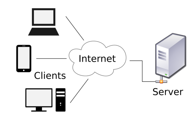
From wikipedia.org
A server is the computer that receives web requests and sends back HTML/CSS/JS as a web response (as opposed to the client, the computer with the web browser that initiates the web request). A server is generally responsible for creating dynamic HTML based on data in a database. For example, if you search for “red bananas” on www.google.com, there isn’t some unique HTML file just about red bananas that gets sent to you from a server. Instead, the server runs code to dynamically create an HTML response based on your search terms. So here you can kill two birds with one stone — since you’re already have a step to generate dynamic HTML on the server, you can use templates to define the generated HTML to keep your code DRY.
Building HTML with templates on the server is a solution that has been the de facto standard for quite some time. Besides PHP, there’s ERB for the Ruby on Rails framework, the Django template language for Python’s Django framework, EJS for Node’s Express framework, etc. This approach can be quite intimidating — in order to take advantage of a template engine to write maintainable code, you essentially first have to learn an entire programming language and web framework! If you were already planning on working with servers and databases, this is a natural fit. But if you were just interested in writing HTML on the frontend, this is quite honestly a huge barrier to entry.
Note: If your website doesn’t require a database, you could instead use a static site generator, which uses templates to build static HTML files (Jekyll, Hugo, and Gatsby are some popular choices). Static site generators can be simpler to use compared to a server-side web framework; however, you’re still required to learn a separate programming language or environment, so there’s still a barrier to entry compared to writing plain HTML.
Using web components on the client #
Web components were first introduced in 2011 as a completely different approach to solving the maintainability issues of HTML. Web components are built on the client as opposed to the server, which removes the barrier of having to learn a server-side programming language and web framework just to write maintainable HTML.
The overall goal of web components is to be able to create reusable widgets. Looking back at the previous example, you could create a navbar component, a header component, and a footer component. Going further, you could create a jumbotron component and an articles component for the content within the page. Then you could use the components in index.html as follows:
<!DOCTYPE html>
<html lang="en">
  <head>
    ...
  </head>
  <body>
    <navbar-component></navbar-component>
    <main role="main">
      <jumbotron-component></jumbotron-component>
      <section class="container">
        <articles-component></articles-component>
      </section>
    </main>
    <footer-component></footer-component>
  </body>
</html>
In order for this to work, we need to create custom elements, where we essentially are defining new elements for the HTML language (that will only work for this particular website). To create a custom element, you have to use JavaScript. Here’s an example of the JavaScript necessary to create the navbar custom element:
window.customElements.define(
  "navbar-component",
  class extends HTMLElement {
    connectedCallback() {
      this.innerHTML = `
        <nav class="navbar navbar-expand-lg navbar-light bg-light" role="navigation">
          <ul class="navbar-nav mr-auto">
            <li class="nav-item active">
              <a class="nav-link" href="#">Home</a>
            </li>
            <li class="nav-item">
              <a class="nav-link" href="#">Info</a>
            </li>
            <li class="nav-item">
              <a class="nav-link" href="#">About</a>
            </li>
          </ul>
          <form class="form-inline my-2 my-lg-0">
            <input class="form-control mr-sm-2" type="text" placeholder="Search" aria-label="Search">
            <button class="btn btn-outline-success my-2 my-sm-0" type="submit">Search</button>
          </form>
        </nav>
       `;
    }
  }
);
The JavaScript looks a bit complex up front (it uses new ES2015 language features), but all it’s doing in this example is defining the HTML for the navbar (shown above in bold) and registering the name navbar-component as a custom element. Note that the HTML is being defined in the JavaScript file using a template literal, essentially a giant string — if you prefer to move this back into a regular HTML file, we’ll need a different mechanism which we’ll discuss in a bit. If you add this JavaScript to the page, you now have the ability to make <navbar-component> elements in addition to normal HTML elements.
So far in this example, there isn’t much advantage to this approach over the server side template approach. However, the benefits become more clear when you start adding JavaScript functionality and CSS styling to each component. Web components offer features to isolate functionality and styling to stay within each component, making them reusable — not just for this site, but theoretically reusable across multiple projects. This concept can be seen with existing HTML elements such as the <video> element. If you write HTML like this:
<video width="320" height="240" controls loop muted>
  <source src="movie.mp4" type="video/mp4">
  <source src="movie.ogg" type="video/ogg">
  <p>Your browser doesn't support HTML5 video. Here is
     a <a href="movie.mp4">link to the video</a> instead.</p>
</video>
You would get a video player that looks like this:

(this is a picture of a video, not an actual video)
The <video> element comes with its own JavaScript interactive controls and CSS styling which are isolated from the rest of the page. This means when you use a <video> element, you don’t have to worry about it affecting the styles or functionality of your site, and you also don’t have to worry about any of the CSS or JavaScript from the site breaking the video component.
The goal of web components is to give developers the ability to create their own custom components similar to the <video> element, with all of its isolation and reusability benefits. Here’s how all the parts of the web components specification work together:
- You can create custom elements in JavaScript as shown earlier. You then can define custom functionality in your JavaScript, as well as pass in attributes from the HTML into the custom element.
- You can use the shadow DOM to style the custom element with CSS that only applies to the element as opposed to the entire document (solving one of the most difficult aspects of CSS).
- If you don’t want to write all your HTML directly in JavaScript, you can use HTML templates, where you write the component’s HTML in a normal HTML file in a
<template>tag, which won’t get rendered until it gets called by your JavaScript. - To organize your code, you can use HTML imports, where you can put all the HTML, CSS, and JavaScript necessary to define a component in a file called
navbar-component.html, which you then would import in the main HTML file just like you would an external CSS file:
<link rel="import" href="navbar-component.html">.
When web components were first announced in 2011, many developers were excited by the possibilities. While server side templating approaches help solve some of the maintainability issues of HTML, web components offered something completely different — the promise of extending HTML will fully featured reusable widgets. This was the missing piece to make the web platform one where you can develop complex applications, as opposed to the simple static content sites it was originally designed for.
So what happened? Over the next several years, it became clear that browsers were not in agreement about web components as a standard. As of 2018, almost no browser fully supports the four main features of web components as described above, due to potential issues with implementation performance, conflicting standards, and varying corporate interests. This left developers in an interesting position — almost everyone agreed that a component style approach was a necessary part of moving the web from static sites to complex applications, but waiting for browser support seemed like an exercise in futility. What to do?
Using JavaScript frameworks on the client #
By the time it became clear that the HTML web component specification wasn’t going to be implemented anytime soon, JavaScript was already a powerful enough language to pick up the slack. Developers had been making complex applications using the jQuery library (released in 2006), although it was difficult to organize the code for large scale applications. Backbone.js (released in 2010) was one of the first popular libraries designed to provide a framework to organize code for large single-page applications, followed by AngularJS, Ember.js, and many others.
All these frameworks worked with existing JavaScript features — they didn’t have to rely on waiting for browsers to implement the web component specification. But none of the frameworks used true components that were isolated and reusable; without the 4 parts of the web component specification (custom elements, shadow DOM, HTML templates, and HTML imports), it didn’t seem possible.
In 2013, a framework called React was released that had an interesting take on this situation. They were able to make a true component-based framework without the web component specification, using the following approaches:
- Instead of using web component’s custom elements specification, React took the approach of defining all HTML in JavaScript. Essentially you would define JavaScript functions to output the desired HTML using a special syntax called JSX (which looks like HTML, but gets converted into JavaScript functions using a build step).
- Instead of using web component’s HTML template specification, React provided no way to write HTML outside of JavaScript.
- Instead of using web component’s HTML import specification, React took the approach of importing JavaScript into JavaScript. This wasn’t actually directly possible at the time, but tools such as Browserify and webpack allowed developers to write
requireorimportstatements in their JavaScript which would get converted at build time into a single JavaScript bundle.
Essentially the insight here is that you could make components work by doing everything in JavaScript. Note that one part of the web component specification is missing here, the shadow DOM — React didn’t have a solution to isolated styling when it was first released. Nevertheless, it was enough to provide a framework for building applications with components today.
This is what the JavaScript looks like using React to make a navbar component:
import React, { Component } from 'react';

class Navbar extends Component {
  render() {
    return (
      <nav className="navbar navbar-expand-lg navbar-light bg-light" role="navigation">
        <ul className="navbar-nav mr-auto">
          <li className="nav-item active">
            <a className="nav-link" href="#">Home</a>
          </li>
          <li className="nav-item">
            <a className="nav-link" href="#">Info</a>
          </li>
          <li className="nav-item">
            <a className="nav-link" href="#">About</a>
          </li>
        </ul>
        <form className="form-inline my-2 my-lg-0">
          <input className="form-control mr-sm-2" type="text" placeholder="Search" aria-label="Search"/>
          <button className="btn btn-outline-success my-2 my-sm-0" type="submit">Search</button>
        </form>
      </nav>
    );
  }
}

export default Navbar;
This isn’t too different from the custom element example shown earlier (although the JSX syntax is unsettling to most developers when they first see it). The idea in React is to break this into further sub-components, such that each component does only one thing.
When React was first released, it was met with a lot of criticism, particularly for its seeming lack of separation of concerns (where developers were taught to keep HTML, CSS, and JS completely separate for maintainability). However, React pushed forward the idea that for complex web applications, separation of concerns isn’t about boundaries between technologies (HTML, CSS, and JS), but instead is about boundaries between units of functionality (in other words, components).
In addition to being a component-based framework, React brought with it strong opinions about how to manage data within an application, using a declarative approach. What this means is that with React, you don’t need to write code to update the interface directly. Instead you define what the interface is supposed to look like (using JSX), write code to update the data, then let React figure out how to update and render the interface efficiently with its virtual DOM implementation (not to be confused with the shadow DOM). This was a major shift in web framework design, influential to the point where every major framework going forward openly borrowed React’s declarative approach using a virtual DOM implementation — Ember, Angular, Vue.js, the list goes on. As of 2018, the web development community has largely embraced this paradigm as the way of building modern web applications.
Note that the desire to write HTML in a clear and maintainable way has led us to a place which requires a great deal of programming knowledge; it is almost impossible to avoid JavaScript in particular. In some sense this breaks the promise of HTML, which was designed to be a language that didn’t require an understanding of programming to be used effectively. It’s possible there will come a future where developers can share pre-built web components in pure HTML, but it may take quite some time before that future arrives.
This section provides only a brief overview of the frontend approaches taken by React and other similar frameworks. If you want more complete explanations and tutorials on how to build a working application using various JavaScript frameworks and approaches, check out my series Comparing Frontend Approaches: A look at jQuery, Vue.js, React, and Elm.
Conclusion #
So this is modern HTML in a nutshell. We covered writing semantic and accessible content using appropriate tags and aria attributes, using CSS and JavaScript to add styling and dynamic features, using HTML attributes and tooling to improve performance, and finally using templates and components to improve maintainability. Along the way we can see that to take full advantage of modern HTML, it is nearly impossible to avoid using a build process as well as some form of separate programming language, which is often JavaScript for most approaches.
Looking at it from a high level can sometimes be discouraging — what used to be a simple and accessible undertaking (making a website with HTML) has now become complex and seemingly unapproachable (making a web application with a JavaScript frontend framework, using a build process with thousands of potentially fragile dependencies). Yet it’s important to note that web development as an industry has only existed for around 30 years — this is a tiny fraction of history compared to other industries (such as architecture, which has been around for many centuries). It’s as if web developers just learned how to build houses out of clay, and are now being asked to use the same tools to build skyscrapers. It’s only natural that our tools and processes evolve; we just have to make sure it evolves in a way that’s inclusive to the original vision of the web as a democratic platform.
Modern HTML can definitely be frustrating to work with as it continues to change and evolve at a rapid pace. Yet we’re able to do more now than ever before, and we are all essentially at the ground floor of a new industry with the potential to shape it into the platform we want it to become. It’s an exciting time to be a developer, and I hope this information can serve as a roadmap to help you on your journey!

Special thanks to @ryanqnorth’s Dinosaur Comics, which has served up some of the finest absurdist humor since 2003 (when dinosaurs ruled the web).
Interested in this style of learning? Be sure to check out Actualize coding bootcamp (where I am the Dean of Instruction as well as a lead instructor). We offer in-person classes in Chicago as well as live online classes to help people transition into new careers as modern web developers!